Tabbed
9.10 New Approach to Tabs
9.10 has added a new approach to creating tabs. Checkout the new Tab extension here!
Overview
New 7.0
Tabbed has been newly added in 7.0.
Tabbed provides a syntax to easily add tabbed Markdown content. The Tabbed extension can be included in Python Markdown by using the following:
Syntax
Tabs start with === to signify a tab followed by a quoted title. Consecutive tabs are grouped into a tab set.
=== "Tab 1"
    Markdown **content**.

    Multiple paragraphs.

=== "Tab 2"
    More Markdown **content**.

    - list item a
    - list item b
Markdown content.
Multiple paragraphs.
More Markdown content.
- list item a
- list item b
In the rare case that you want to follow two separate tab sets right after each other, you can explicitly mark the start
of a new tab set with !.
=== "Tab 1"
    Markdown **content**.

    Multiple paragraphs.

=== "Tab 2"
    More Markdown **content**.

    - list item a
    - list item b

===! "Tab A"
    Different tab set.

=== "Tab B"
    ```
    More content.
    ```
Markdown content.
Multiple paragraphs.
More Markdown content.
- list item a
- list item b
Tab Select
New 9.7
If you'd like to force a tab to be selected, simply use ===+, otherwise, the first tab will be selected by default.
=== "Not Me"
    Markdown **content**.

    Multiple paragraphs.

===+ "Select Me"
    More Markdown **content**.

    - list item a
    - list item b

=== "Not Me Either"
    Another Tab
Note
If you are using JavaScript to track selected tabs across pages, or some other tab related feature that adjusts selected tabs, it may interfere with the default selected tab. This is not an indication that there is a bug, but an indication of incompatible features.
Tab IDs
New 9.0
By default, tabs generate IDs for each tab using the following template __tabbed_<tab_set_number>_<tab_number>. If it
is desired to implement jumping to a specific tab with more intuitive IDs, it may be preferable to generate IDs from
slugs. To do so, two options are provided: slugify and separator.
Tip
Jumping to tabs via IDs may require additional JavaScript to select the targeted tabs.
If slugify is given a slug function (you can use any that ship with Pymdownx Extensions), the
Tabbed extension will generate IDs from the tab titles just like headers. separator allows for the specifying of the
word separator (- is the default).
If you'd like the slugs to be prefixed with the slug of the parent header, you can enable the combine_header_slug
option. If you had the following example, normally the header slug would be header and the content tab would have the
slug tab.
With combine_header_slug enabled, the header slug would still be header, but now the content tab slug would be
header-tab.
New 10.1
combine_header_slug is new in 10.1
Styling with CSS
In order to use tabbed blocks, some additional CSS is needed. You can check out the configuration below which will show the CSS and the HTML it targets. Keep in mind that the CSS provided below is just the minimum needed to get you started. You can tweak it and modify it to get it how you like it.
In general, tabbed controls are wrapped in a <div> with the class tabbed-set. They contain an
<input> with an ID of __tabbed_<tab_set_number>_<tab_number>. All the <input> elements from a
specific tab set will use the name __tabbed_<tab_set_number>. Particularly, a user should be mindful of the ID to keep
from explicitly using a conflicting ID. Auto-generated slugs shouldn't conflict though.
Tabbed Code Setup
This is a very basic setup. Tabs can be styled in different ways, but this shows how to get it functionally working. Here we show what it visually looks like, what the generated HTML looks like, and what the CSS looks like.
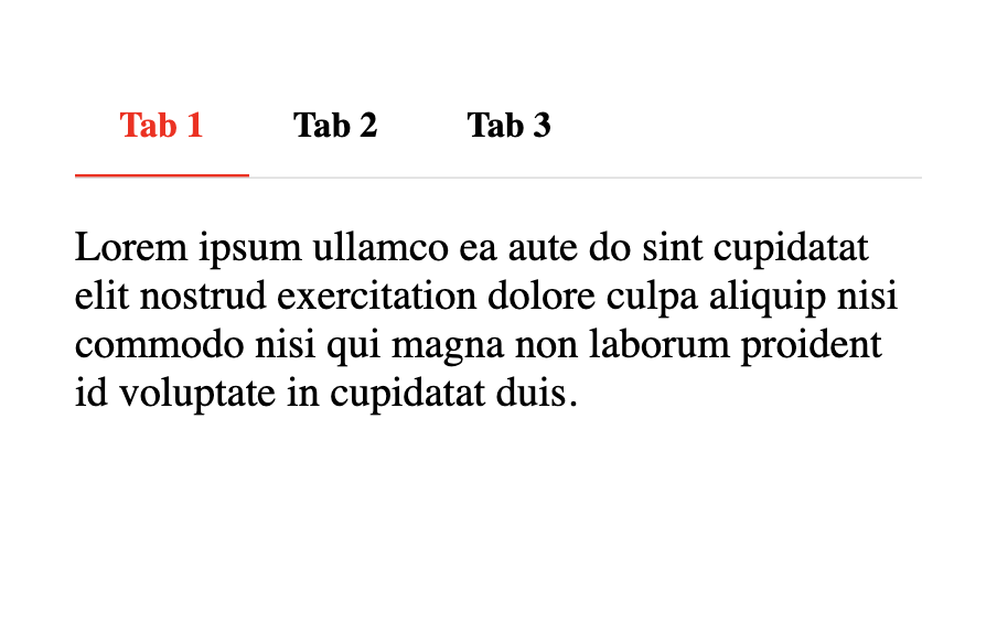
<div class="tabbed-set" data-tabs="1:3"><input checked="checked" id="__tabbed_1_1" name="__tabbed_1" type="radio" /><label for="__tabbed_1_1">Tab with a really long title 1</label><div class="tabbed-content">
<p>Lorem ipsum ullamco ea aute do sint cupidatat elit nostrud exercitation dolore culpa aliquip nisi commodo nisi qui
magna non laborum proident id voluptate in cupidatat duis.</p>
</div>
<input id="__tabbed_1_2" name="__tabbed_1" type="radio" /><label for="__tabbed_1_2">Tab with a really long title 2</label><div class="tabbed-content">
<p>Lorem ipsum ullamco ea aute do sint cupidatat elit nostrud exercitation dolore culpa aliquip nisi commodo nisi qui
magna non laborum proident id voluptate in cupidatat duis.</p>
</div>
<input id="__tabbed_1_3" name="__tabbed_1" type="radio" /><label for="__tabbed_1_3">Tab with a really long title 3</label><div class="tabbed-content">
<p>Lorem ipsum ullamco ea aute do sint cupidatat elit nostrud exercitation dolore culpa aliquip nisi commodo nisi qui
magna non laborum proident id voluptate in cupidatat duis.</p>
</div>
</div>
/* General environment setup */
html {
  background-color: black;
  height: 100%;
}
body {
  font-size: 120%;
  width: 100%;
  padding: 1em 2em;
  margin: 0 auto;
  background-color: white;
  height: 100%;
}

/* Tab style starts here */
.tabbed-set {
  position: relative;
  display: flex;
  flex-wrap: wrap;
  margin: 1em 0;
  border-radius: 0.1rem;
}

.tabbed-set > input {
  display: none;
}

.tabbed-set label {
  width: auto;
  padding: 0.9375em 1.25em 0.78125em;
  font-weight: 700;
  font-size: 0.84em;
  white-space: nowrap;
  border-bottom: 0.15rem solid transparent;
  border-top-left-radius: 0.1rem;
  border-top-right-radius: 0.1rem;
  cursor: pointer;
  transition: background-color 250ms, color 250ms;
}

.tabbed-set .tabbed-content {
  width: 100%;
  display: none;
  box-shadow: 0 -.05rem #ddd;
}

.tabbed-set input {
  position: absolute;
  opacity: 0;
}

.tabbed-set input:checked:nth-child(n+1) + label {
  color: red;
  border-color: red;
}

@media screen {
  .tabbed-set input:nth-child(n+1):checked + label + .tabbed-content {
    order: 99;
    display: block;
  }
}

@media print {
  .tabbed-content {
    display: contents;
  }
}
Linked Tabs
Some sites will link tabs across tab containers. The easiest way to explain this is by example. Click a tab below and see how they seem linked:
People ask about how to get this functionality from time to time, and the answer is JavaScript. It is the only real way to get such functionality. While this can be achieved with varying degrees of intelligence – save preferences across pages for example – we've provided a very basic example of how to accomplish this below.
The function, when called, will setup click events for every tab. When clicked, it will look for tabs of the same name on the page and ensure they also get selected. It works for the default style and the new alternate style.
const tabSync = () => {
  const tabs = document.querySelectorAll(".tabbed-set > input")
  for (const tab of tabs) {
    tab.addEventListener("click", () => {
      const current = document.querySelector(`label[for=${tab.id}]`)
      const pos = current.getBoundingClientRect().top
      const labelContent = current.innerHTML
      const labels = document.querySelectorAll('.tabbed-set > label, .tabbed-alternate > .tabbed-labels > label')
      for (const label of labels) {
        if (label.innerHTML === labelContent) {
          document.querySelector(`input[id=${label.getAttribute('for')}]`).checked = true
        }
      }

      // Preserve scroll position
      const delta = (current.getBoundingClientRect().top) - pos
      window.scrollBy(0, delta)
    })
  }
}
Special Considerations
If you are combining this feature with something like "tab select", you may have to not link tabs on initial page load to ensure the default is not overridden. The example above does not initiate tab linking on initial page load, only registration of the event. Some may attempt to implement tab linkage such that selected tabs are remembered across pages, special consideration would be required in such situations and is beyond the scope of this simple example.
Alternate Style
New 9.0
Experimental Feature
The original idea behind the Tabbed extension was to provide a tabbed interface in Markdown that could be driven purely by CSS. If JavaScript was disabled or unavailable, tab functionality would remain.
@squidfunk (Martin Donath), the author and maintainer of the MkDocs Material theme, who originally collaborated on the first Tabbed style, approached us again with a newer style.
The aim was to solve one big problem, namely that on narrower screen sizes (like mobile), tabs are broken onto separate lines, like here for example.
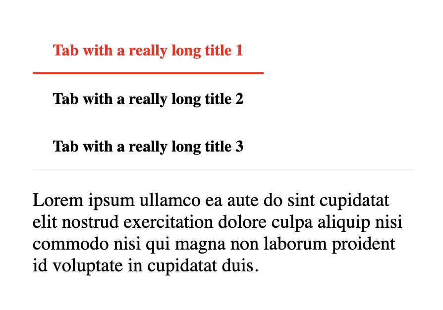
And this is indeed a real issue with the current style. The bonuses of the current style is that it needs absolutely no JavaScript and is driven by CSS alone. It supports as many tabs as you can throw at it but the downside is that when all the tabs do not fit on a single line, they'll wrap which is not aesthetically pleasing in all themes or interfaces.
So, a new style was proposed, and we once again worked to hammer out the details, and in the end, we think we have something that is better in many ways. The new style works with only CSS and does not actually need any JavaScript to be functional, but it is ideally enhanced with a little JavaScript. The reason why is that when too many tabs are on a single line, you can overflow them with CSS and make the tab container scrollable. This can provide a much more aesthetically pleasing interface, but there are two caveats though:
- When tabs overflow, if you want a visual indicator that there are more tabs, it requires a little JavaScript.
- The number of tabs is limited by how many tabs you define in the CSS.
As for the first point, this seems an acceptable restraint. When JavaScript is available, you will get a nice visual indicator, but if JavaScript is ever not available, or disabled, tab functionality will still work, just without the indicators.
As for the second point, this also seems acceptable as most pages will usually have some upper limit of tabs that are ever used. Pages can become quite cluttered when using too many tabs, and it seems reasonable that most would limit them to some practical number.
Alternate Tabbed Code Setup
The example below styles the tabs, adds indicators that work as buttons to navigate to the next tab when the there are overflowed tabs, and scrolls tabs into view smoothly.
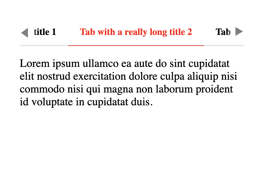
<div class="tabbed-set tabbed-alternate" data-tabs="1:3"><input checked="checked" id="__tabbed_1_1" name="__tabbed_1" type="radio" /><input id="__tabbed_1_2" name="__tabbed_1" type="radio" /><input id="__tabbed_1_3" name="__tabbed_1" type="radio" /><div class="tabbed-labels"><label for="__tabbed_1_1">Tab with a really long title 1</label><label for="__tabbed_1_2">Tab with a really long title 2</label><label for="__tabbed_1_3">Tab with a really long title 3</label></div>
<div class="tabbed-content">
<div class="tabbed-block">
<p>Lorem ipsum ullamco ea aute do sint cupidatat elit nostrud exercitation dolore culpa aliquip nisi commodo nisi qui
magna non laborum proident id voluptate in cupidatat duis.</p>
</div>
<div class="tabbed-block">
<p>Lorem ipsum ullamco ea aute do sint cupidatat elit nostrud exercitation dolore culpa aliquip nisi commodo nisi qui
magna non laborum proident id voluptate in cupidatat duis.</p>
</div>
<div class="tabbed-block">
<p>Lorem ipsum ullamco ea aute do sint cupidatat elit nostrud exercitation dolore culpa aliquip nisi commodo nisi qui
magna non laborum proident id voluptate in cupidatat duis.</p>
</div>
</div>
</div>
/* General environment setup */
html {
  background-color: black;
  height: 100%;
}
body {
  font-size: 120%;
  width: 20em;
  padding: 1em 2em;
  margin: 0 auto;
  background-color: white;
  height: 100%;
}

/* Tab style starts here */
.tabbed-alternate {
  position: relative;
  display: flex;
  flex-wrap: wrap;
  flex-direction: column;
  margin: 1em 0;
  border-radius: 0.1rem;
}

.tabbed-alternate > input {
  display: none;
}

.tabbed-labels {
  display: flex;
  width: 100%;
  overflow: auto;
  box-shadow: 0 -0.1rem #ddd inset;
  scrollbar-width: none;
}
.tabbed-labels::-webkit-scrollbar {
  display: none;
}
.tabbed-labels > label {
  width: auto;
  padding: 0.9375em 1.25em 0.78125em;
  font-weight: 700;
  font-size: 0.84em;
  white-space: nowrap;
  border-bottom: 0.1rem solid transparent;
  scroll-snap-align: start;
  border-top-left-radius: 0.1rem;
  border-top-right-radius: 0.1rem;
  cursor: pointer;
  transition: background-color 250ms, color 250ms;
}
.tabbed-labels > label:hover {
  color: red;
}

.tabbed-labels.tabbed-scroll-left::before {
  display: inline-block;
  font-size: 0.9em;
  position: absolute;
  top: 0.75em;
  left: 0;
  padding-right: 0.64em;
  color: gray;
  background: linear-gradient(to right, rgb(255, 255, 255) 75%, rgba(255, 255, 255, 0));
  content: "\25C0";
  cursor: pointer;
}

.tabbed-labels.tabbed-scroll-right::after {
  display: inline-block;
  font-size: 0.9em;
  position: absolute;
  top: 0.75em;
  right: 0;
  padding-left: 0.64em;
  color: gray;
  background: linear-gradient(to right, rgba(255, 255, 255, 0), rgb(255, 255, 255) 25%);
  content: "\25B6";
  cursor: pointer;
}

.tabbed-alternate .tabbed-content {
  width: 100%;
}
.tabbed-alternate input:nth-child(1):checked ~ .tabbed-content > :nth-child(1),
.tabbed-alternate input:nth-child(2):checked ~ .tabbed-content > :nth-child(2),
.tabbed-alternate input:nth-child(3):checked ~ .tabbed-content > :nth-child(3) {
  display: block;
}
.tabbed-alternate .tabbed-block {
  display: none;
}
@media screen {
  .tabbed-alternate input:nth-child(1):checked ~ .tabbed-labels > :nth-child(1),
  .tabbed-alternate input:nth-child(2):checked ~ .tabbed-labels > :nth-child(2),
  .tabbed-alternate input:nth-child(3):checked ~ .tabbed-labels > :nth-child(3) {
    color: red;
    border-color: red;
  }
}
@media print {
  .tabbed-labels {
    display: contents;
  }
  .tabbed-labels > label:nth-child(1) {
    order: 1;
  }
  .tabbed-labels > label:nth-child(2) {
    order: 2;
  }
  .tabbed-labels > label:nth-child(3) {
    order: 3;
  }

  .tabbed-alternate .tabbed-content {
    display: contents;
  }
  .tabbed-alternate .tabbed-block {
    display: block;
  }
  .tabbed-alternate .tabbed-block:nth-child(1) {
    order: 1;
  }
  .tabbed-alternate .tabbed-block:nth-child(2) {
    order: 2;
  }
  .tabbed-alternate .tabbed-block:nth-child(3) {
    order: 3;
  }
}
// Identify whether a tab bar can be scrolled left or right and apply indicator classes
const tabOverflow = () => {
  const checkScroll = e => {
    // Use a margin as we just don't always align exactly on the right.
    const margin = 3
    const target = e.target
    if (!e.target.matches('.tabbed-labels')) {
      return
    }

    const scrollWidth = target.scrollWidth - target.clientWidth
    target.classList.remove('tabbed-scroll-left', 'tabbed-scroll-right')
    if (e.type === "resize" || e.type === "scroll") {
      if (scrollWidth === 0) {
        return
      }
      if (!target.scrollLeft) {
        target.classList.add('tabbed-scroll-right')
      } else if (target.scrollLeft < scrollWidth - margin){
        target.classList.add('tabbed-scroll-left', 'tabbed-scroll-right')
      } else {
        target.classList.add('tabbed-scroll-left')
      }
    }
  }

  // Change the tab to either the previous or next input - depending on which indicator was clicked.
  // Make sure the current, selected input is scrolled into view.
  const tabChange = e => {
    const target = e.target
    const selected = target.closest('.tabbed-set').querySelector('input:checked')
    let updated = null

    if (target.classList.contains('tabbed-scroll-right') && e.offsetX >= e.target.offsetWidth - 15) {
      const sib = selected.nextSibling
      updated = selected
      if (sib && sib.tagName === 'INPUT') {
        updated = sib
      }
    } else if (target.classList.contains('tabbed-scroll-left') && e.offsetX <= 15) {
      const sib = selected.previousSibling
      updated = selected
      if (sib && sib.tagName === 'INPUT') {
        updated = sib
      }
    }
    if (updated) {
      updated.click()
    }
  }

  const onResize = new ResizeObserver(entries => {
    entries.forEach(entry => {
      checkScroll({target: entry.target, type: 'resize'})
    })
  })

  const labels = document.querySelectorAll('.tabbed-alternate > .tabbed-labels')
  labels.forEach(el => {
    checkScroll({target: el, type: 'resize'})
    onResize.observe(el)
    el.addEventListener('resize', checkScroll)
    el.addEventListener('scroll', checkScroll)
    el.addEventListener('click', tabChange)
  })
}

// Smooth scroll tab into view when changed
const tabScroll = () => {
  const tabs = document.querySelectorAll(".tabbed-alternate > input")
  for (const tab of tabs) {
    tab.addEventListener("change", () => {
      const label = document.querySelector(`label[for=${tab.id}]`)
      label.scrollIntoView({block: "nearest", inline: "nearest", behavior: "smooth"})
    })
  }
}

// Should run after document loaded, but for illustration purposes:
tabOverflow()
tabScroll()
Options
| Option | Type | Default | Description |
|---|---|---|---|
alternate_style |
bool | False |
Use the experimental, alternative style. |
slugify |
function | None |
A function to generate slugs from tab titles. |
separator |
string | '-' |
Default word separator when generating slugs. |
combine_header_slug |
bool | Combine the parent header slug with the tab content slug. |